Wednesday, December 11, 2013

Procedurally generated levels

After discarding a few prototypes, I settled on an action roguelike game with procedurally generated levels. The foundation for the tech has been easier than I feared.

I arranged blue squares that represent rooms. The actual rooms, consisting of many brown cells and optional side entrances in blue (depending on the existence of an adjacent room), are authored and randomly chosen. Pieced together like a puzzle. Orientation of the entire level and each room is random. There are special rooms for hallways and in the future, corners.

It only takes a handful of rooms and arrangements to reach millions of uniquely generated worlds.

(mirrored as part of the randomization)

(mirrored as part of the randomization)

There is no limit to the size of a level.


Things will get even more interesting, when I sprinkle in spawn locations for treasures, enemies, and traps.

Monday, December 2, 2013

*Snap*

*Snap* Long story short, I have a spiral-fracture on my distal humerus, just above the elbow, almost severing the radial nerve. The two pieces of bone were disjoint. In other words, my dominant arm will be in a brace for six weeks, forearm hanging in a sling from my neck. Two weeks down, four more to go. The pain has subsided before my frustration.

Thankfully, Zombie Tactics basically is finished and being auctioned off to a sponsor. You could say this incident occurred at a "convenient" time.


I am unable to draw to produce art assets in the meantime. Using the mouse is a tad awkward with my left hand. At least I can still type 85wpm using an additional keyboard, flipped upside down and positioned like a guitar on my lap.

I'm attempting to be 90% finished with code and design on my next unannounced game by mid January, allowing me to perform an art pass once I get my arm back. I was planning to pursue a similar development process anyways. I still love working on tiny projects.

From my perspective, I get to begin 2014 with my arm back, and a much greater appreciation of being self-employed. I have learned to be more thankful for my health, skills, and opportunity to do what I love.

Thursday, October 24, 2013

Zombies in beta

At last my turn based tactical game has reached beta status...! Surely but steadily, piece by piece. This definitely is my largest project as an indie. Now I can sit back and basically play-test each of the five endings and survival mode. Private testing will come sooner or later.

I made an effort to introduce features and content gradually in story mode, so the player is not overwhelmed and turned away in confusion. There are 66 items and 36 human abilities, against the 8 zombie types. It was great practice to get in there and rapidly draw everything one after the other.


This is a Flash browser game that will be sponsored for the web. Originally it was for tablets, but that fell through for several reasons.

Backgrounds continue to be my overall weakness, though I'm pleased with how they turned out. I sketched everything, did an ink and color pass, and then hue shifted each scene to change the mood. They all get cached as bitmaps anyways, so there is no cost to filters and details. I threw away the old subway station background because it looked so lackluster.

On a design level, everything came together nicely. It will take some additional tweaking to get the difficulty of the game to feel right.

Conveniently, I have new ideas to pursue while this project wraps up in a part-time QA phase. I would like to try simulation / micro tycoon games, like create your own brewery, winery, or even shooting range with individual target pieces plopped down on some top-down grid.

I'm also inspired by bits and pieces of American history, like the Battle of Gettysburg which took place nearby. Also Bunker Hill seems interesting for a time-based survival defense game, because historically the onslaught of British forces eventually captured the location. It is much easier to use an existing story anyways.

Monday, September 23, 2013

Ludum Dare 27 Results

The Village of Lost Time has been ranked 18th place overall in Ludum Dare 27!


Is also ranked 13th place for graphics. The art was heavily inspired by Toy Defenders, and it was partially inspired by Kingdom Rush. I admire the simplicity of shapes and colors in games like these. Scribblenauts is another one I have been reviewing from an artistic point of view; I love it.

Monday, September 9, 2013

That grind

I made several changes to help reduce the amount of downtime in the game. The allies no longer return to the subway station, which acted like a main menu to exchange items and train in skills. Those interface features still exist; the merchant and skills trainer emerge after a battle immediately to trigger the interface options. It feels more natural and less disruptive.

Battle

Downtime, placeholder characters for merchant, equipment, skills trainer.

As a way of balancing the game, selected allies can scavenge for equipment and money while others stay behind. It is a risk versus reward mechanism.

This month I have to bring everything together and do a full balance and bug fix pass. Meanwhile I want to squeeze in some dialog and at least four other backgrounds. This has been a huge undertaking, but I am confident it will all come together.

Tuesday, August 27, 2013

The Village of Lost Time

On the weekend I participated in compo Ludum Dare 27! The 48 hour solo game jam held three times a year. It looks like the number of total entries almost hit a new record of 2213. The theme was "10 seconds" winning by a landslide in the final voting round. My suggestion "You must leave it behind" got a lot of buzz and ended up in third place.

My entry is called "The Village of Lost Time". It embraces the 10 second theme by rewinding time prior to your daughter's demise. As you control a villager, the game records the movement and replays it for each sequential session. Eventually you have this massive army built up. The goal is to fend off the spirits that take your daughter, destroying totems to harvest appropriate magic.


The Good

  • I gained a lot of experience. This was the absolute first game I made where it was entirely playable using crude placeholder art. Rectangles and circles everywhere, but it worked. I spent the first day programming everything, and the second on art, audio, and dialog. Now I can repeat this process with confidence.
  • I slept eight hours both nights (the jam begins at 9PM) and I did not consume more caffeine than I normally would. I stuck to my typical daily routine.

The Bad

  • Sound effects. I used as3sfxr for most of them, with limited time to record my own, such as chopsticks and knives hitting my desk. The spirit sound is me blowing over a plastic bottle all warped up in Audacity.
  • There is no music. Only after the jam did I come across this amaaaazing program that can generate a unique song using specified structure and arrangement. Yes, this is allowed, and even recommended.

The Ugly

(technical ramblings)

The original 48 hour version suffers from a technical bug that causes incorrect movement of the previously recorded villagers but only as the game progresses. Basically, each frame I was recording the keyboard controls, so the currently controlled villager and recorded ones would compute velocity and position using the same function.

The time step is a fixed number so frame rate should not matter. Floating point errors are expected in numerical integration, but it is all feeding off the exact same data each session. Eventually recordings get bugged and seem to worsen each sequential session, as if bad data is bleeding into the mix.

I fixed it by only storing the positions each frame, calculating velocity only for the current villager. This guarantees it to work accurately.

Saturday, August 10, 2013

Equipment

Recently I took a trip to the Museum of Modern Art in NYC. Currently in the atrium is a special "mouse exhibit" that had on display over a hundred items in a dark room, ranging from toys to tools. Supposedly its purpose is to overwhelm the viewer by everyday objects, due to the large number of pieces, each demanding equal attention. The viewer, like a mouse, scans around a cluttered room. There is no focal point of the art.

At least that was my impression of it all.

In a way, I used it as inspiration to create these 61 items for my game. There are eight items per category with the exception of special rare equipment, tentatively sorted in ascending order of power. Each human can equip one on the left panel, plus one on the right.


I need a few junk items too, so I suppose the total will be bumped up to a nice and even 64, power of two.

Wednesday, August 7, 2013

Semi finalized menus

Below is the same interface from the previous blog entry, with the first art pass. Still, placeholder description text for a sense of scale. Ignore the botched shadows.

It is very motivating to be able to wake up in the morning and assign myself the task of fully implementing any one of these features. For example, "hmm today I feel like adding all the art and code for the twelve achievements". Another day I may add virtually all the sound effects or music.

Speaking of that, I have noticed that I definitely work best immediately after waking up. That three hour block of time can be a critical window of opportunity to accomplish something important. Often, it can be the majority of what actually gets done that day.

From left to right: skills, encyclopedia, missions, achievements, extra equipment, options.


Wednesday, July 31, 2013

The underground subway concept

This is the underground subway station, home of the survivors. All of this is placeholder art. There are several options to choose from, depicted by actual objects in the scene. Basically this is the third iteration of this aspect of the game.


I'm a bit torn on adding story elements. Perhaps there will be a television or radio (optionally usable) that broadcasts the status of the rest of the city. Or, maybe the survivors will carry on brief conversations before or after missions.

Saturday, July 27, 2013

All abilities are functional

I have just completed all the special abilities, getting things ready for balance and play-testing.

That innocent looking scientist has quite a few tricks up his sleeve, definitely a worthy member to the player's party. Don't mess with the nurse either.

Meanwhile the athlete with the red hat is trying to determine whether to call his soccer ball a football for non US and Canadian gamers... but then what would he call his other football? You know, the brown oval shaped one. Awkward.


I plan to allow two inventory slots per human for additional benefits and perks. For example, weapons allow a free hit at the beginning of the player's turn. Other items can regenerate health, increase damage, and even award an extra turn.

Critically, half the entertainment value of this game will be in the progression on a macro scale - finding new allies, leveling them up, collecting equipment, discovering new areas and zombie types. Surprises around every corner can keep a player interested. The player will have a great deal of freedom this time, compared to predetermined battles and loot in my previous games.

Monday, July 22, 2013

Goat Mechanic & Paladin vs Demons

My two latest apps Paladin vs Demons and Goat Mechanic have been approved and released to Apple's app store, and Google Play! Additionally, both have been approved by Samsung to be admitted into the 100% Indie section of the Samsung app store (coming soon).


Cross-platform Mobile App Development Showcase

The Epace Games homepage has been updated accordingly.

Thursday, July 18, 2013

The entire cast

I really like to establish all my character art early in a project. The tradition dates years back when I was just a programmer, at the mercy of the availability of free art assets that I would scrounge from the net. I would build a game around the accumulated collections of models and texture packs. Now I have the luxury of crafting the art around the design instead.

The humans share the same paper doll animation set, switching each body part frame accordingly. The zombies are all manually animated because of the varying sizes and body parts.


Creating a character at a three-quarters view is fairly straight forward. Given time, I think anyone can do it. If using Flash, just sketch with the brush tool, erasing as often as drawing new lines. Use Google Images for reference material. The head by far is the most important part. Be very sloppy and care free, as the purpose of the lines is to create the shapes and proportions. It should "feel" more like sculpting rather than drawing.

Occasionally, make a duplicate and then continue the process. Each iteration will bring you closer to the desired result, as you add things that complement the character, while removing features that hinder it. For example, the mustache, nurse hat, and cigar remained. 

Continue until you end up with something good enough to finalize, by tracing over and splotching in shadows and highlights using the "Paint Inside" brush tool.


The process works well for me. It takes about one to four hours per character. It reserves ample time to dedicate to the many other important aspects of the game.

Sunday, July 14, 2013

Pieces

It has been a very productive week. I finished many of the major battle systems, leaving just pieces from here on out. It is very easy for me to add in new projectiles, weapons, and even characters. Humans take a bit more time, as they have at least half a dozen active and passive abilities.


Pathfinding uses the A* algorithm, which never ceases to amaze me. It tends to work right out the box. It is easily configured to work for hexagons because it only needs a heuristic distance function and knowledge of a cell's n-number of neighbors. Cells can be rejected early if occupied by a character or prop. Easy.

My previous two projects, Paladin vs Demons and Goat Mechanic each for iOS have been submitted to Apple a third time. There were mistakes in the in-app purchases.

Tuesday, June 18, 2013

Hexagon goodness

I have a lot of the design of my next tactical turn based game finished. Most of the ideas came to me while camping multiple times in the woods over the month. It is much easier to think creatively in the presence of nature.
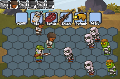
Art concept with placeholder icons

Notice how with hexagons, all adjacent cells are equidistant from each other. In a square grid, moving diagonally basically is cheating because it has a greater physical distance. You could just limit movement to vertical and horizontal on a grid, but that would be four possible directions instead of six with hexagons. Hexagons win. Also, very importantly, a character immediately one row below another will never block visibility (see the two neighboring skeleton zombies).

Organize a squad of survivors. Each survivor optionally can move each turn, before using an ability exclusive to their class. Currently, classes include hunter, ninja, farmer, athlete, scientist, medic, mechanic, and butcher. It is a good blend of melee, range, and support which hopefully should stir up all kinds of strategies and class combinations.

Each class will have several (four?) abilities. For example, a hunter can shoot a rifle that penetrates everything in a line of hexagons. The farmer can throw a scarecrow decoy in a small radius. Athletes can hit a baseball that bounce off neighboring zombies for increased damage (think the scout in TF2, or chain lightning).

Survivors can hold additional secondary items. Such as a helmet for extra defense, or perhaps a machete for a free attack against a random adjacent zombie, triggered at the beginning of the player's turn.

Probably it will be free to play on iOS and Android, featuring exclusive premium content for additional classes and content. Also it wouldn't hurt to have a banner in that top right corner. 

Making a mobile app does have its problems though. It's fantastic the iPhone 4 and 5 have a brilliant high resolution display, but the screen will always be quite small. I have found that the above hexagon layout is just the right size, without having to scroll around.

Friday, May 24, 2013

The Zombie Invasion

I have noticed a consistent demand for wall-based zombie defense games, especially after the release of Zombie Situation a year ago. For example, these three games:

Zombie Wranglers (web)
Zombie Age (Android)
Zombie Defense (Android)

I am very certain that all three of these used Zombie Situation as a piece of inspiration, based on the design, art, and even the audio in the bottom two apps. I find it to be flattering. I used existing games as inspirational material during the development of Zombie Situation as well, so my game can be seen as an intermediate branch. It is so fascinating to experience firsthand the evolution behind game development.

The bottom two apps are doing quite well for themselves, based on the number of downloads. I could see myself making something similar, but I am getting really tired of developing wall-based defense games. The luxury of being a self-employed developer not only consists of pursuing attractive opportunities, but choosing not to pursue them as well. It would be my fourth one of the genre, followed by Zombie Situation and the Defend Your Nuts series. My assumption was proven correct when I sat down to prototype one for my Android device:


As a developer, the popularity behind this type of game is insufficiently motivating. The foundation is nothing to me, so development would be dull. So, I brainstormed exclusively through art, resulting in this:


Which transitioned into a tactical turn-based hexagon concept, similar to Dragon Age Journeys:


I'm intrigued. It welcomes strategies on both a micro and macro level. It can feature ridiculous melee weapons like frying pans and golf clubs. Meanwhile I have been reading Apocalypse Z while watching zombie movies and shows such as Dawn of the Dead and The Walking Dead, so I can't help but gather ideas rapidly. I have yet to sleep on this particular concept, so we will see what the future holds.